Physitrack Rebrand
Branding
Client:
Physitrack
Scope:
Company Rebrand
Year:
2024
Overview
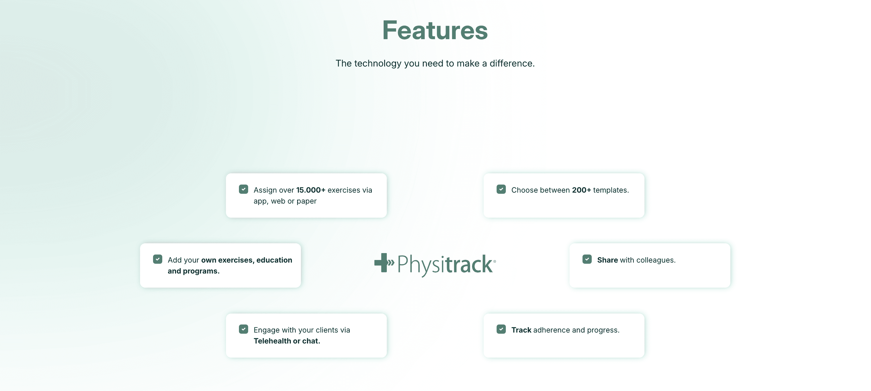
Physitrack is a digital healthcare company that provides tools for clinicians and healthcare organisations to engage patients throughout their care journey, especially in physiotherapy and musculoskeletal care. Its core offerings include digital exercise prescription, patient engagement tools and patient app (Physiapp).
Originally the brand identity was tied to the early exercise prescription product and build in the company’s early days. As Physitrack extended its offerings and acquired multiple products over time, the old brand no longer reflected the sophistication of the platform and the group felt less cohesive and harder for external audiences to recognised a unified leader in digital healthcare.
Its visual style needed to feel modern and appealing to both clinics and patients. The old greens and elements were functional, but the company wanted a brand that better communicated innovation and bold tech focus.
Collaborating with the marketing and product teams, the creation of wireframes and multiple test variations helped us establish a clear design direction. The idea was to keep some elements from the old branding to maintain consistency with the current platform users, while exploring new ideas.


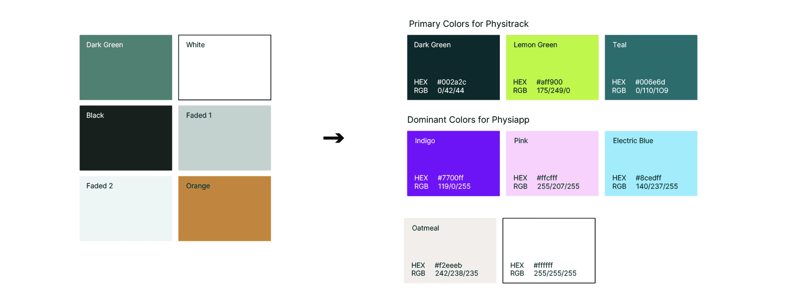
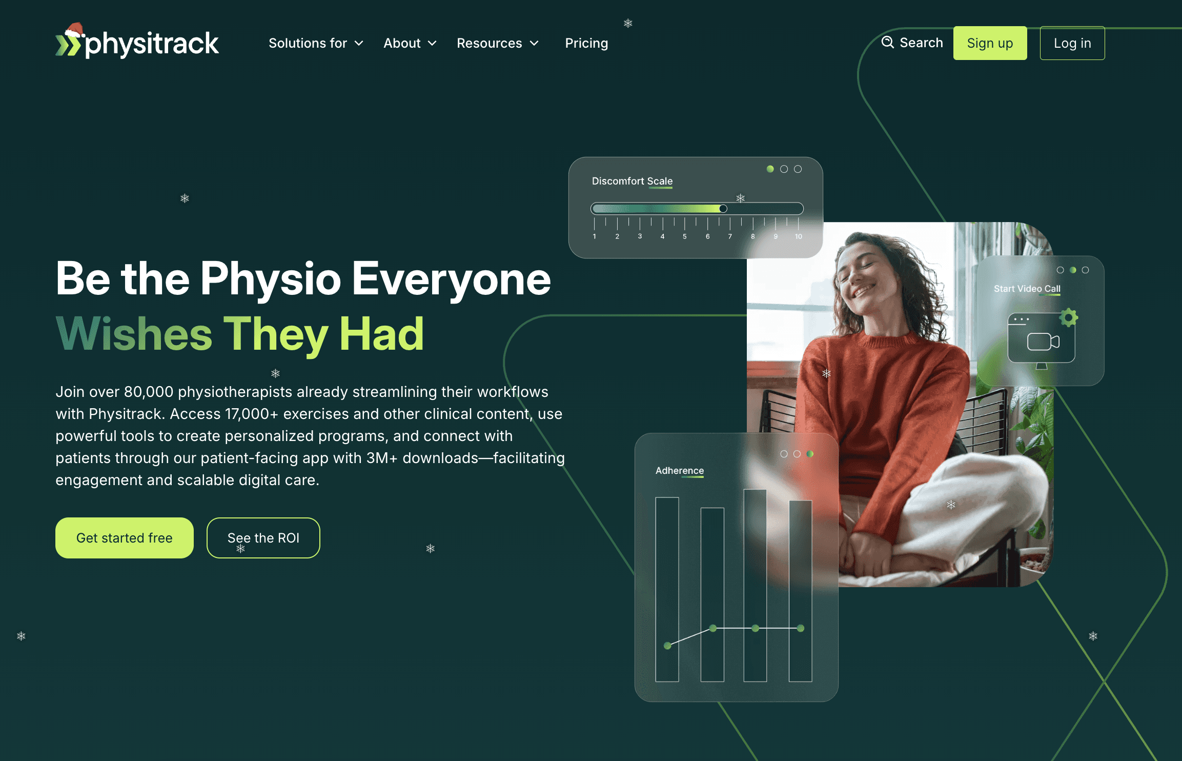
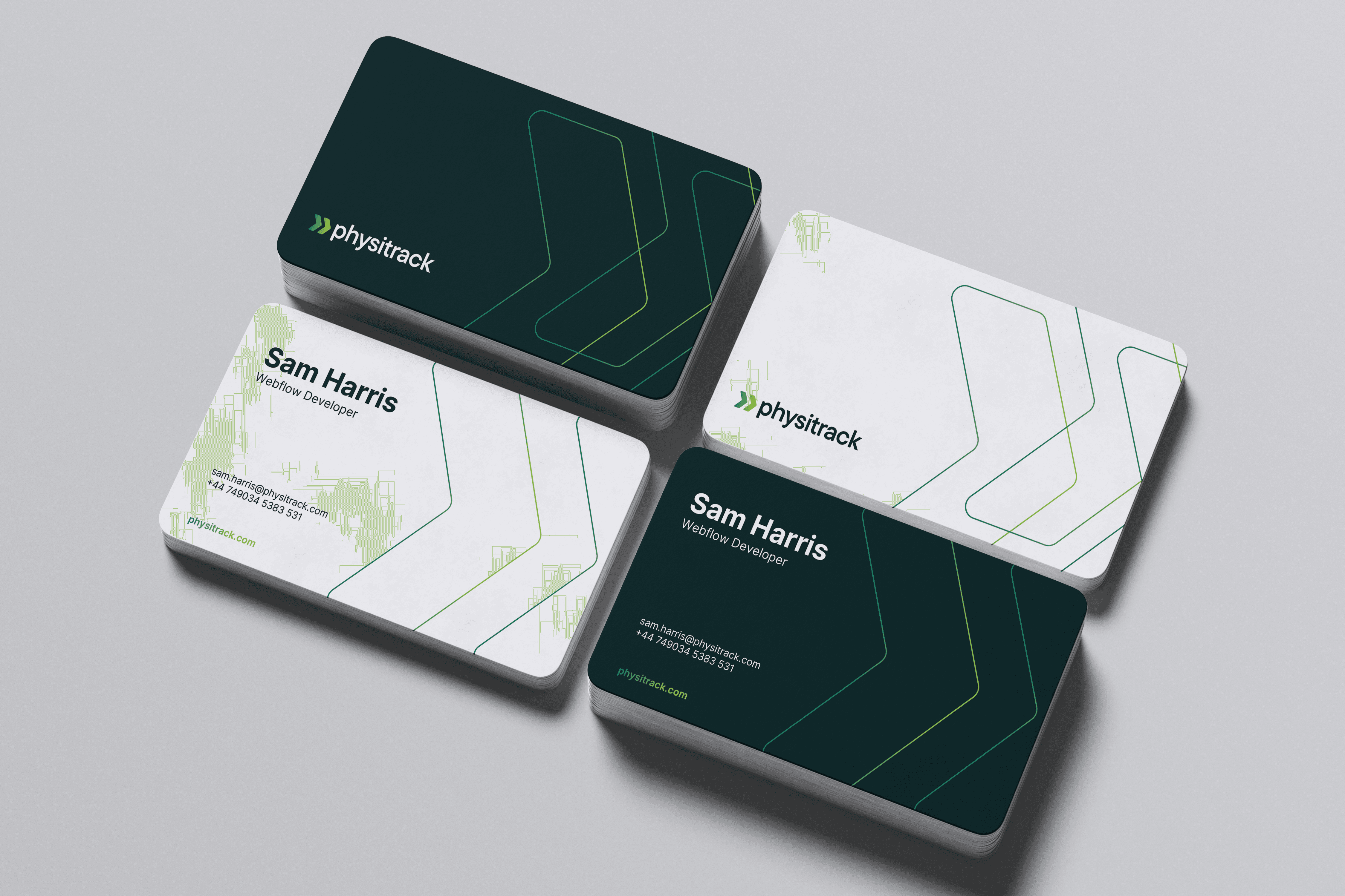
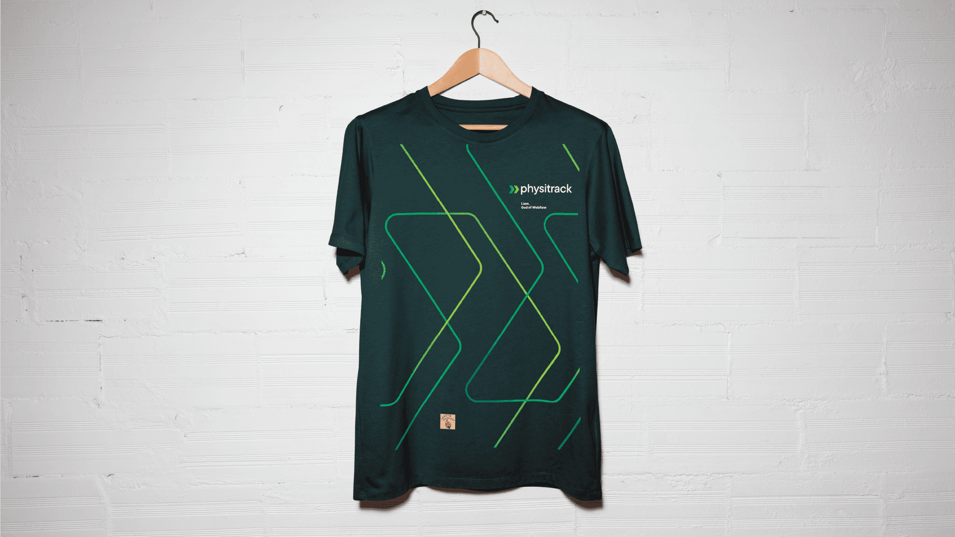
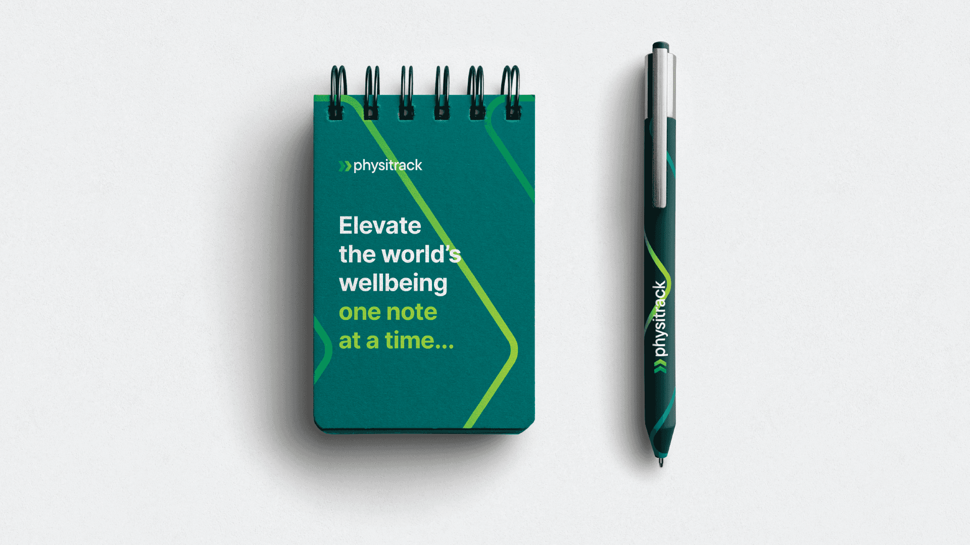
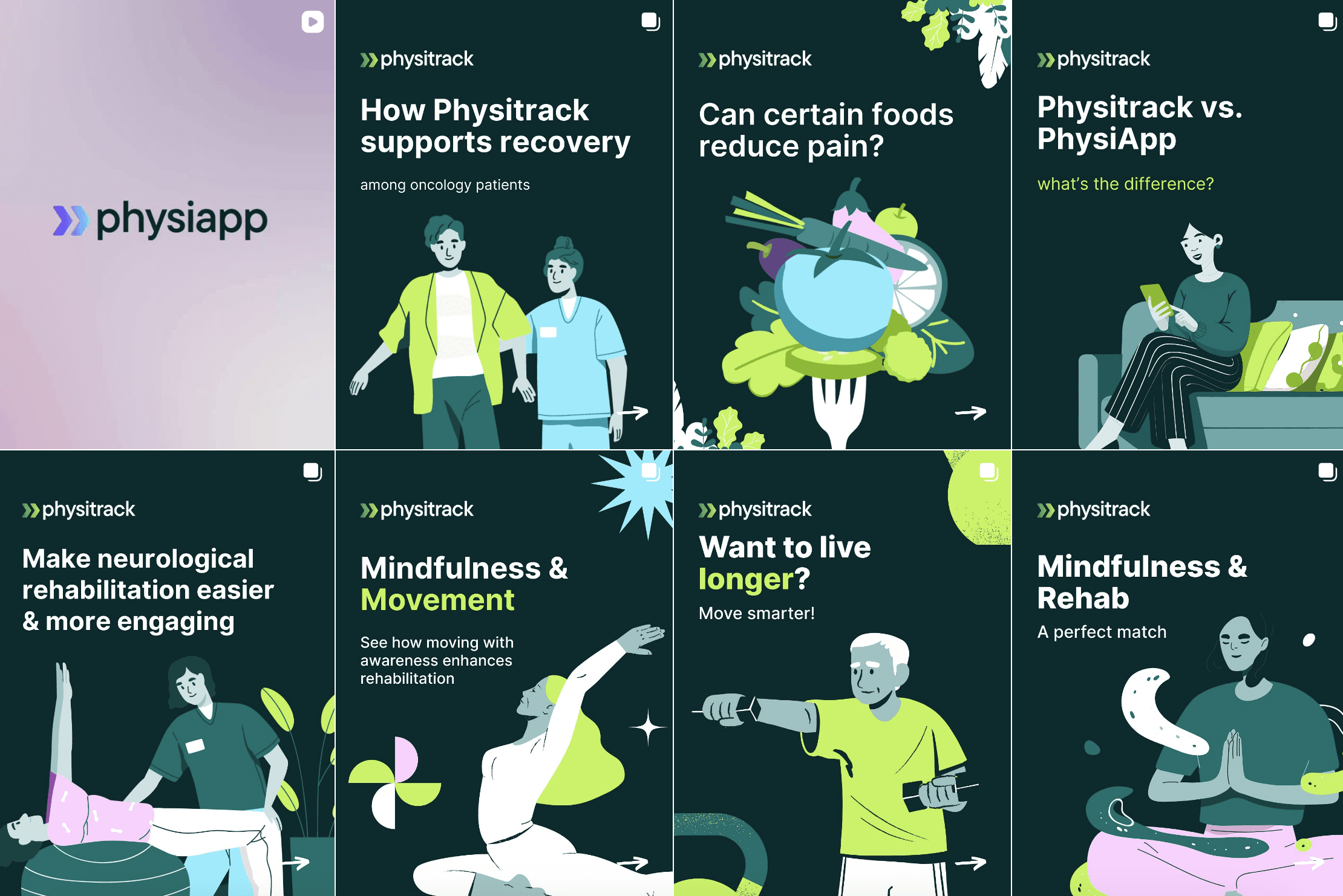
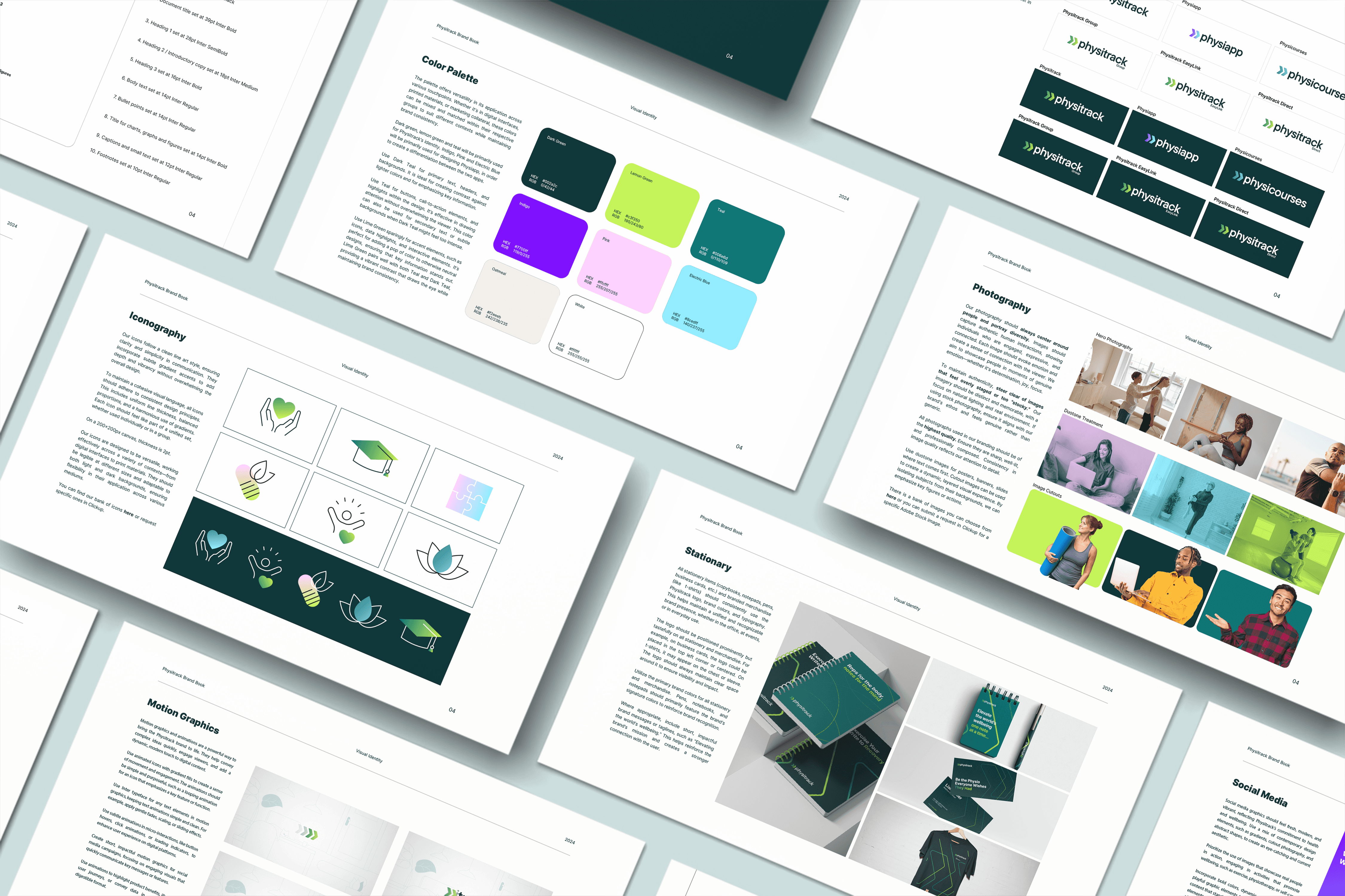
Physitrack’s new identity includes a new logo, color scheme, typeface and a comprehensive style guide for the whole group. All sub-groups have been re-branded as well in order to maintain consistency and be recognised as a group.
The old green was still a part of the re-brand as a primary color and the small arrows from the old logo became the current logo mark, reflecting a sense of moving forward in the digital space. The colors have been chosen to emphasise boldness, tech and health and the palette offers versatility in its application across various touchpoints. A clean, rounded typeface for clarity and professionalism.
The final branding guidelines below: