Employee Enablement Platform
Helping Organisations

Client:
Physitrack
Scope:
UI/UX
Year:
2025
Overview
As Physitrack grew, onboarding and enablement became increasingly fragmented. New hires were given tasks, links, and documents across multiple tools, but often lacked a clear sense of what mattered most or how everything fit together. At the same time, managers and HR struggled to get a clear overview of progress, risks, and gaps.
This project explores how onboarding and enablement could be treated as structured journeys rather than disconnected tasks.
I’m a senior designer working across multiple disciplines, including UX/UI, visual design, and motion.
I led this project end-to-end, from problem framing to system design and wireframing, collaborating closely with the marketing team to align onboarding, internal communication, and brand tone.
As the company grew, onboarding and enablement started to feel fragmented. New hires were given tasks, links, and documents from multiple sources.
Evidence & Insights:
• New hires frequently rely on Slack messages, personal notes, and informal guidance to navigate onboarding.
• Managers manually track onboarding progress.
• Workarounds such as personal checklists and bookmarked documents indicate missing prioritization and guidance.
The goal was to design a platform that:
Helps employees focus on what they need to do, in the right order while making them accustomed to the brand, tone and voice
Gives managers and HR clear visibility without micromanaging
Works alongside existing tools instead of trying to replace them
A centralised platform to store all the guidance needed for all employees regardless of their role or department
Design Principles:
• Context before content: explain why something matters before presenting details.
• Guide, don’t replace: integrate with existing tools instead of consolidating them.
• Progressive disclosure: reveal complexity only when needed.
• Visible ownership
• Role-aware experiences: design for employees, managers, and HR distinctly.
User Journeys (High-Level):
For Employees:
Sees assigned paths and tasks
Understands priorities at a glance
Focuses on execution
For Managers/HR:
Monitors progress and risks
Intervenes when needed
Configures and reuses paths
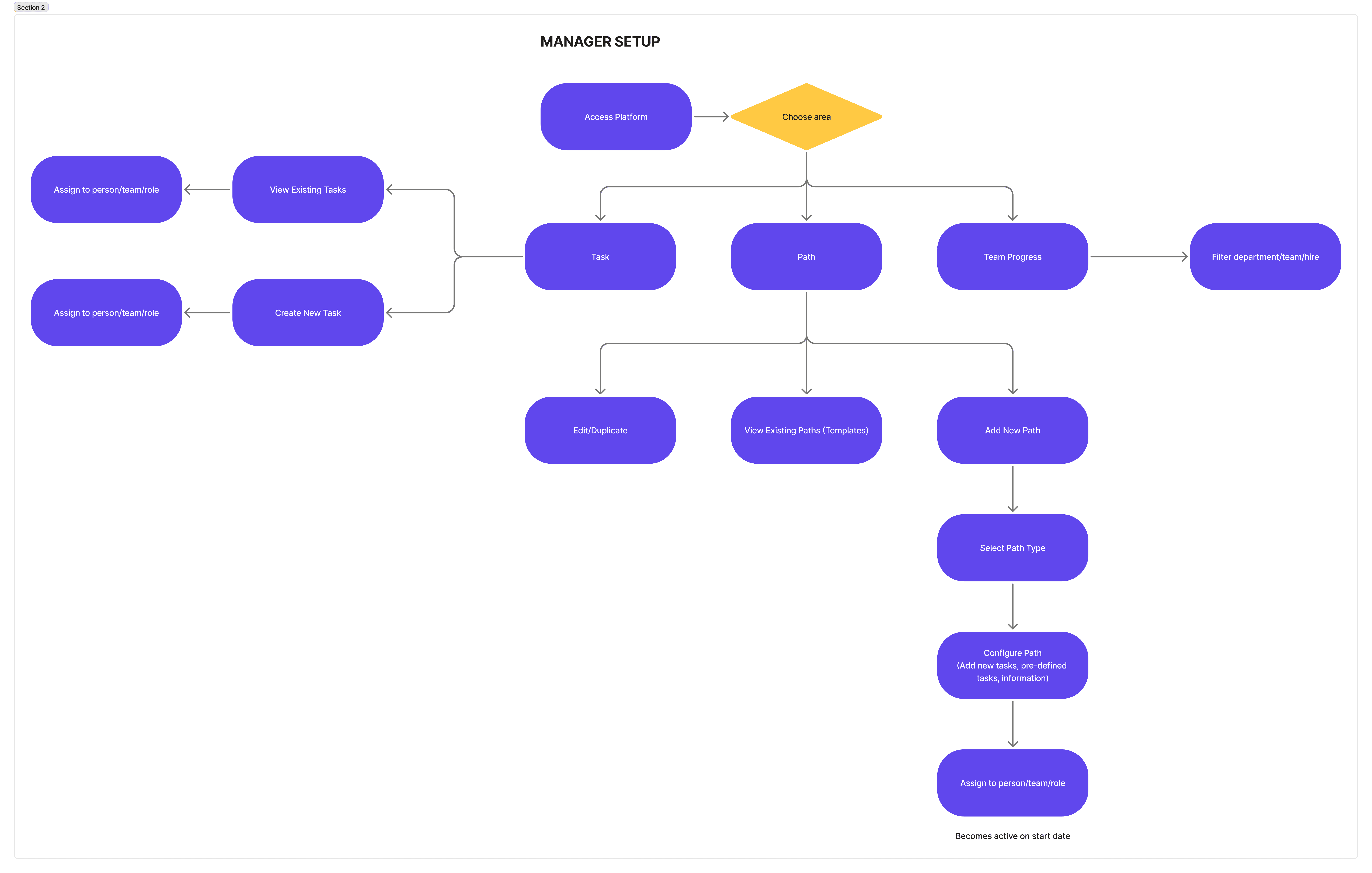
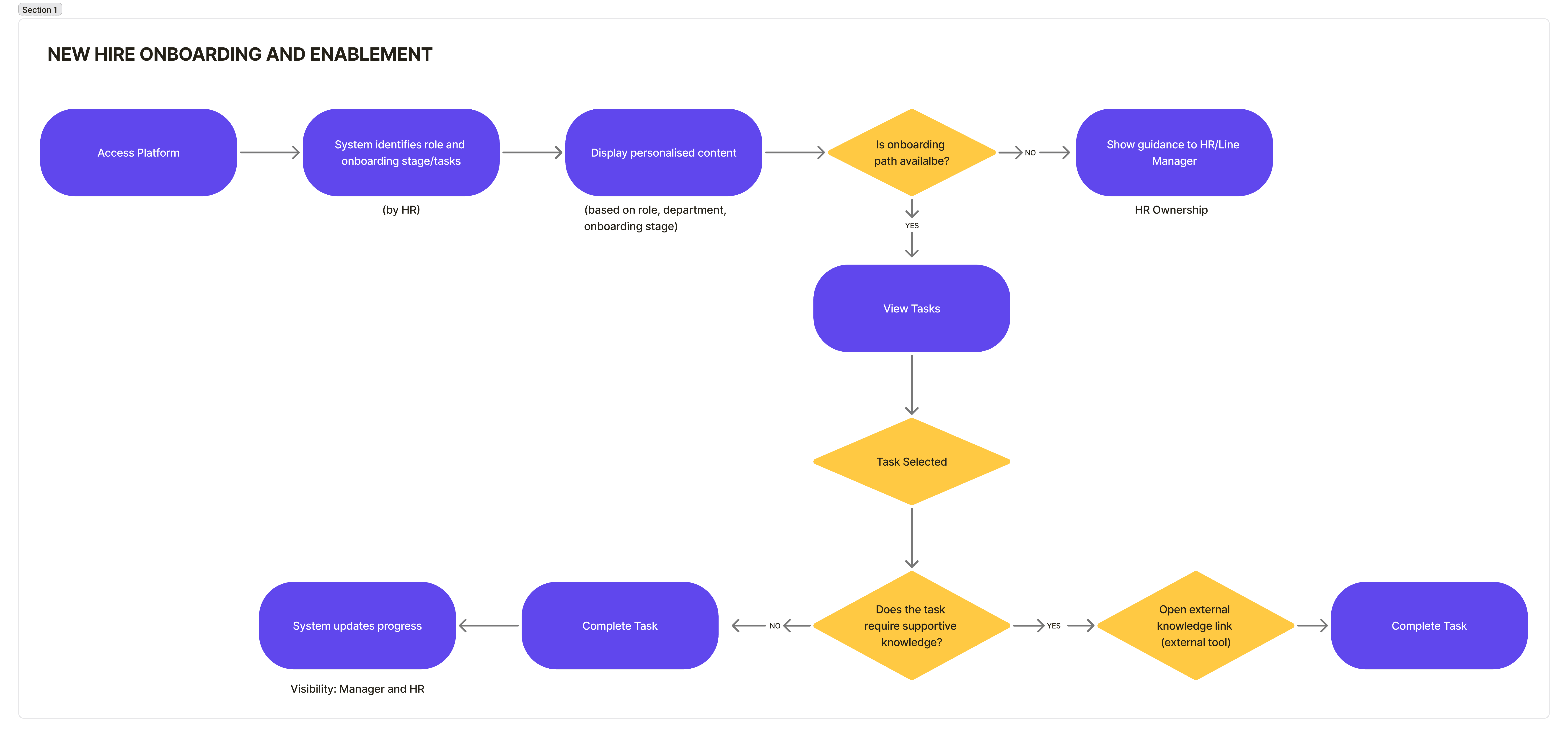
Key Screens & Decisions
Employee Dashboard
This is the first screen a new hire or employee would see, so the focus here was clarity and reassurance. Instead of showing everything at once, the dashboard highlights what’s relevant right now, meaning current paths, upcoming tasks, and any important updates.
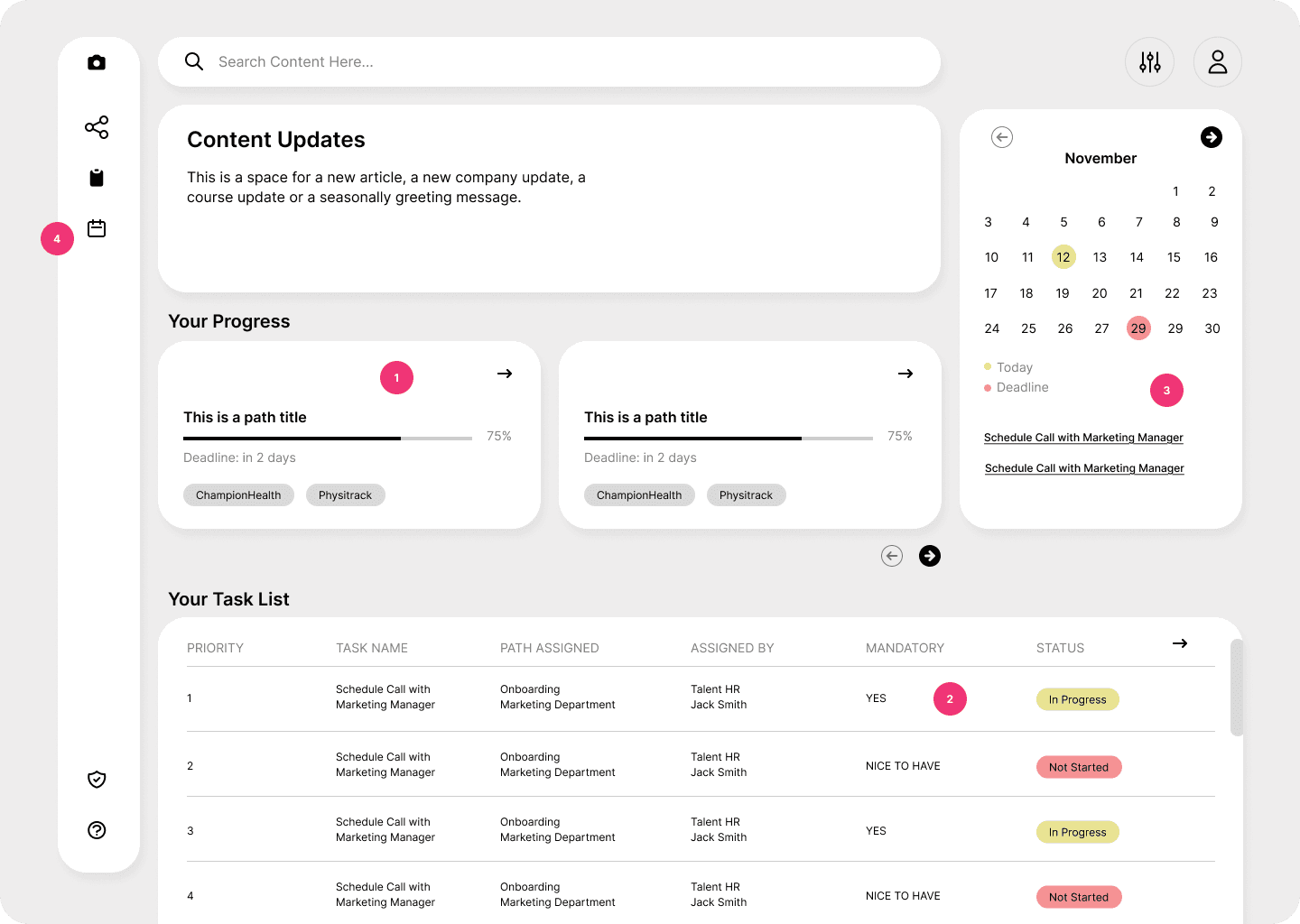
1 - I chose to surface progress by path rather than only showing individual tasks. This helps employees understand why they’re doing something and how each task fits into a broader onboarding or enablement journey, instead of feeling like they’re just working through a random checklist.
2 - Tasks are marked as mandatory or optional to help employees prioritise without needing extra context or guidance from a manager.
3 - Upcoming deadlines are shown in a lightweight calendar view to support time awareness, without turning the dashboard into a scheduling tool. The goal is to reduce surprises, not create pressure.
4 - Menu accesses a general separate path and task windows.
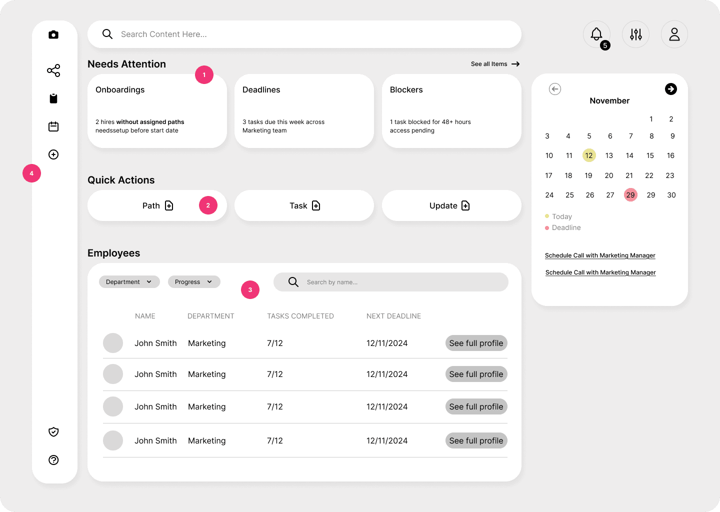
For HR/Managers
For managers and HR, the job is very different. They don’t need to see every update, they need to know when something requires attention.
That’s why this dashboard starts with a “Needs attention” section. Instead of a notification feed, it surfaces gaps and risks, such as missing onboarding paths, upcoming deadlines, or blocked tasks (1).
Below that, managers can quickly see how their team is progressing and jump into more detailed views only when needed.
4 - Menu has a 'Create' button that allows HR and managers to build paths, resources, tasks, updates and assign them to different teams or departments.
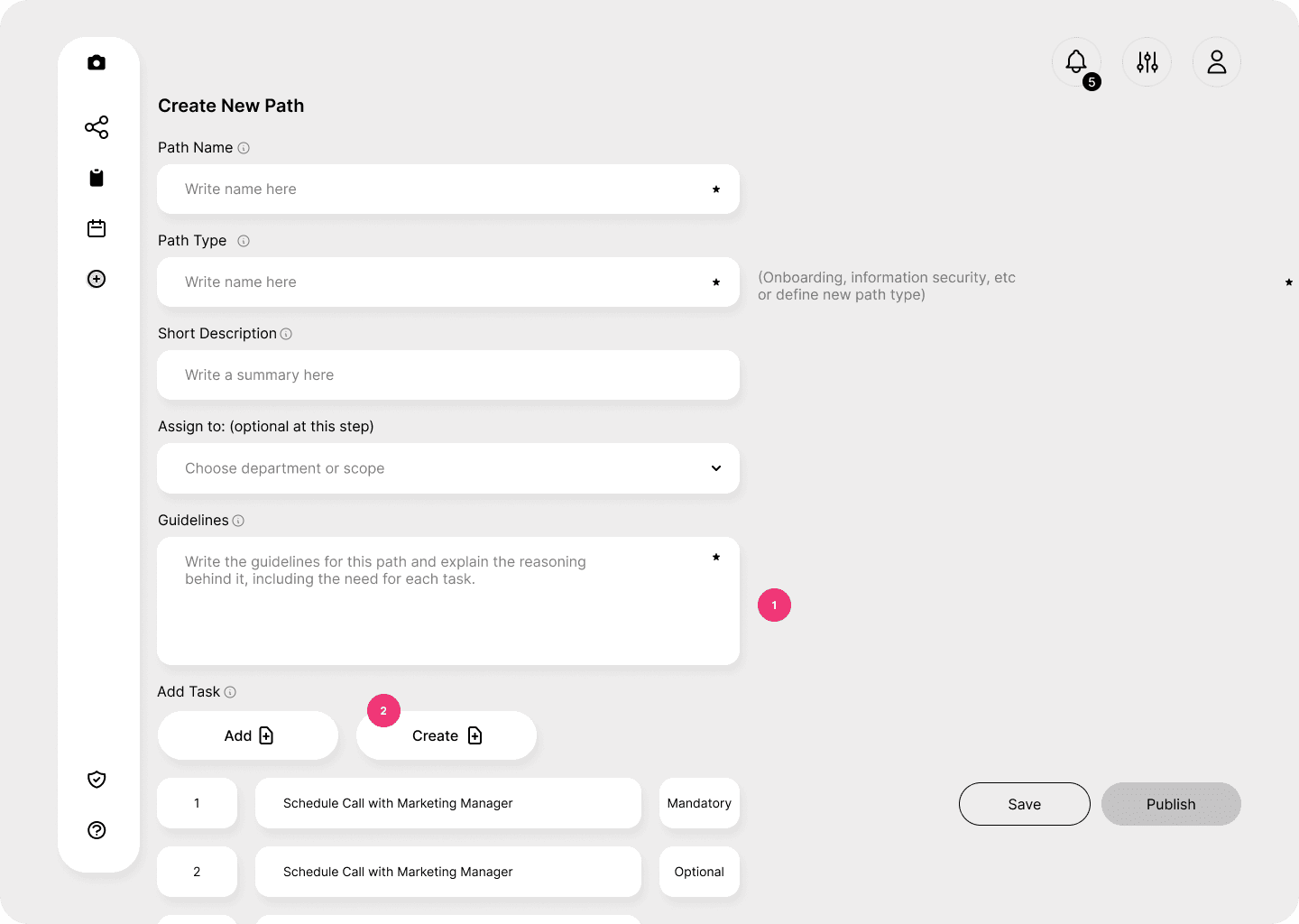
3. Path Configuration
The Configure Path screen is where most of the system logic comes together. I designed this screen to reflect how people actually think when setting something up: what is this path for, who is it for, and what should happen in what order.
Tasks can be added from an existing library or created when needed (2), and each task is marked as mandatory or optional. This rule is defined once here and then reflected consistently in the employee experience. Paths can be saved as drafts or published when ready, which supports review, especially in a healthcare context.
This project is still a work in progress. While the core UX and system logic are defined, there’s ongoing work around implementation details especially in collaboration with development teams. This includes discussions around how data would be imported, how user accounts and roles would be mapped, and how the platform would integrate with existing tools already used across the company.
Working through this has also made it clear just how large this initiative is. Onboarding and enablement touch multiple teams, systems, and workflows, and decisions in one area often have implications elsewhere.