Champion Health Rebrand
Branding, Social Media
Client:
Champion Health
Scope:
Branding, Social Media
Year:
2025
Overview
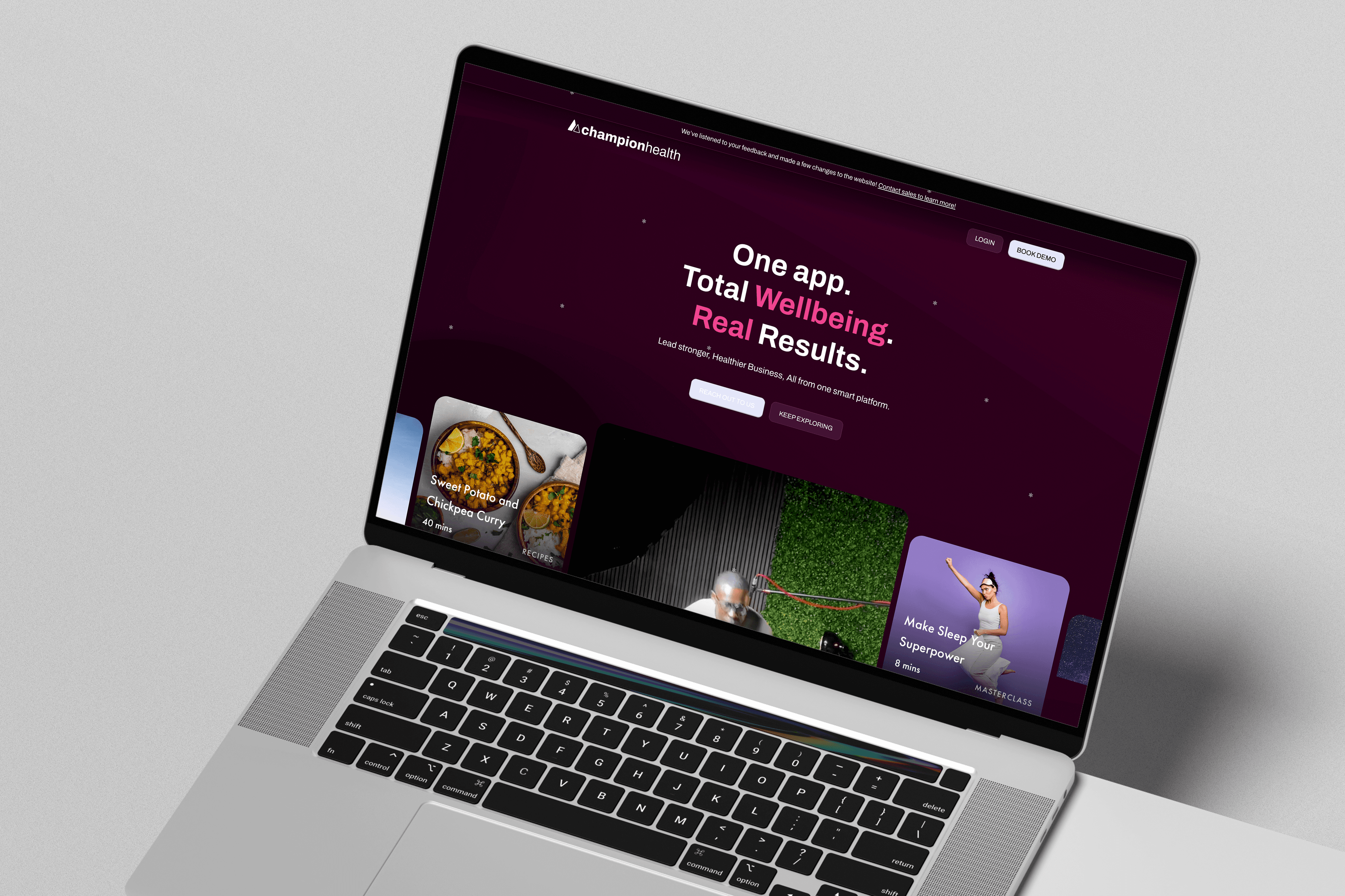
Champion Health is a workplace wellbeing platform focused on mental health, physical health, and preventative care. Because the brand operates in a sensitive, people-centred space, the goal of the rebrand wasn’t to reinvent the company, but to refine how it shows up visually, emotionally, and practically for its audience.
This resulted in a smaller, considered rebrand that prioritised accessibility, clarity, and approachability, while giving the brand more tools to communicate dynamically across channels.
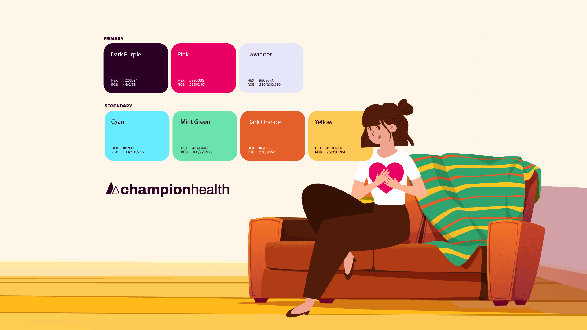
Rather than introducing an entirely new palette, the existing colours were subtly adjusted. Contrast ratios were checked and refined to meet accessibility standards. The result preserved brand recognition while making the interface and materials easier to read and more comfortable to engage with.
This ensured the brand remained familiar to existing users while becoming more usable for everyone.
The original color scheme:
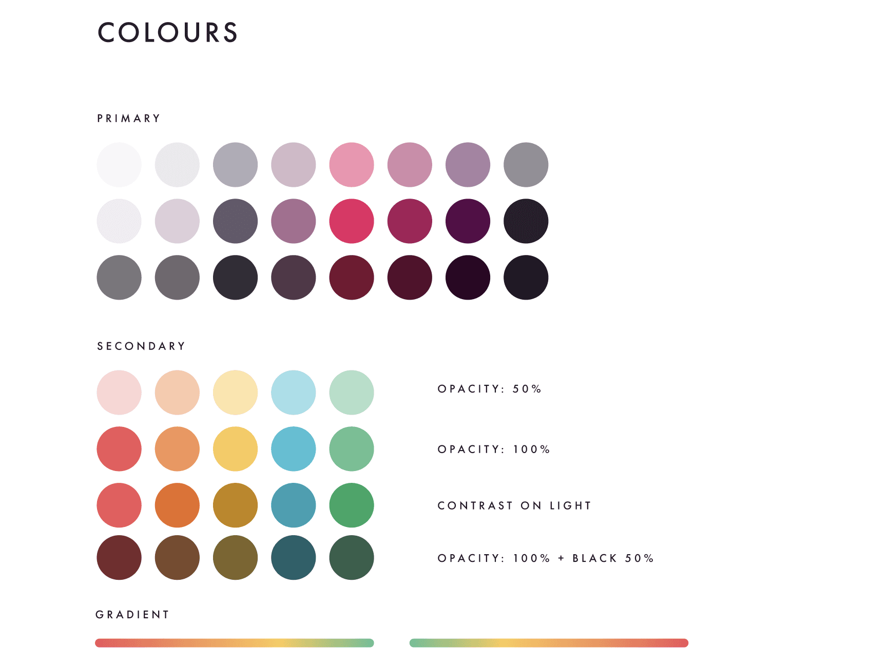
Became:
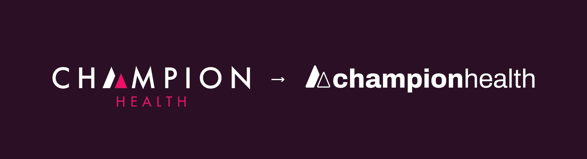
The logo evolution focused on refinement rather than replacement. Shapes were subtly reshaped to feel less rigid and more approachable.
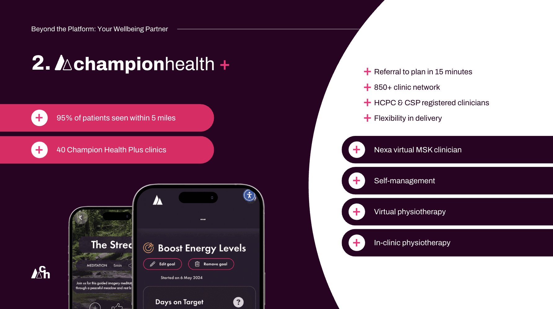
One of the most important outcomes of the rebrand was not just how things looked — but how consistently they could now be created. I introduced presentation templates, illustration styles for social media making the content feel friendlier and animation guidelines for explainers, helping Champion Health communicate complex topics in a more accessible way.
This rebrand succeeded because it was audience-led, where accessibility was treated as a foundation, not an afterthought. Visual changes were aligned directly with the company's mission and services and the brand gained flexibility without losing trust or familiarity.
The impact also translated into social media consistency, from this:
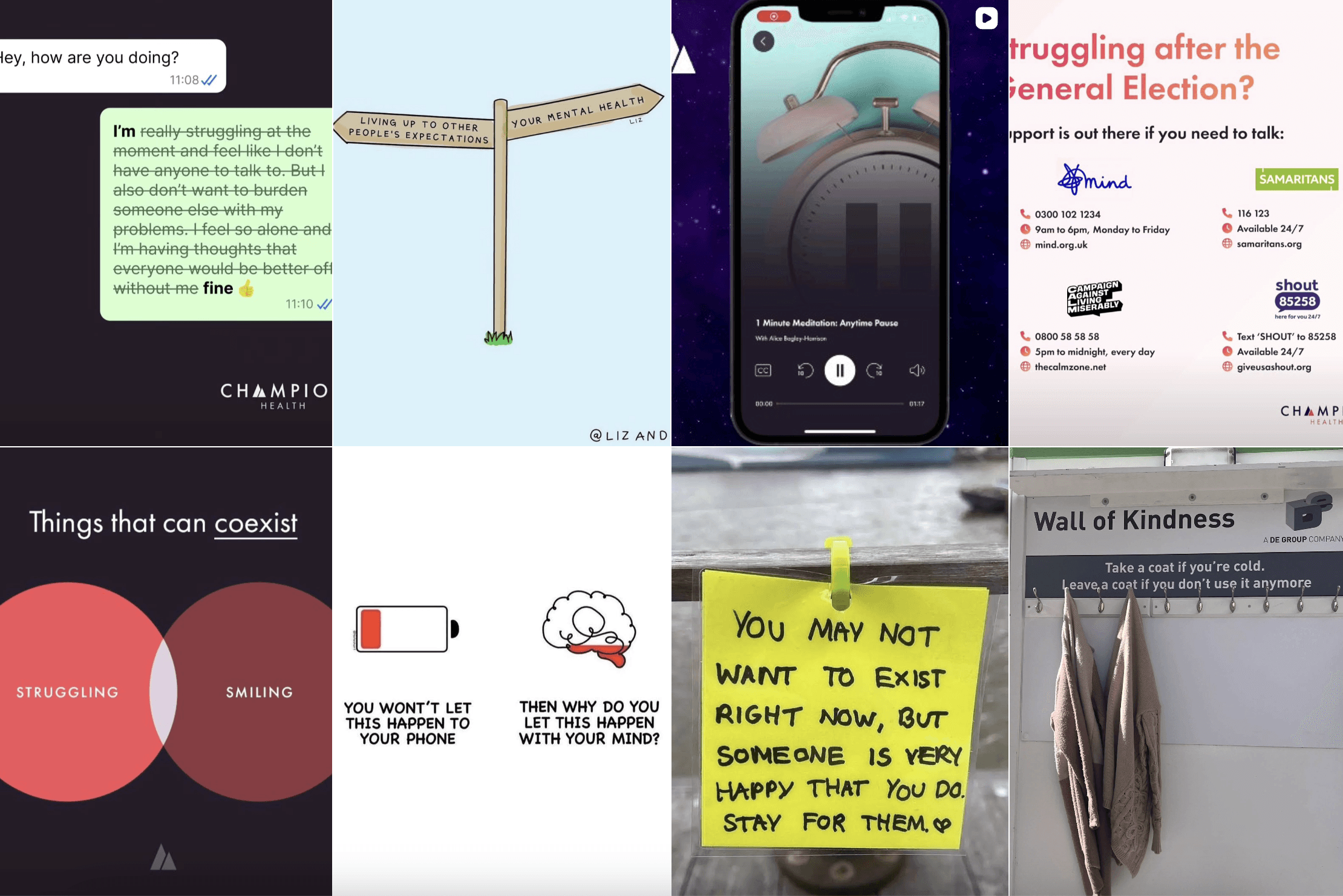
To this:
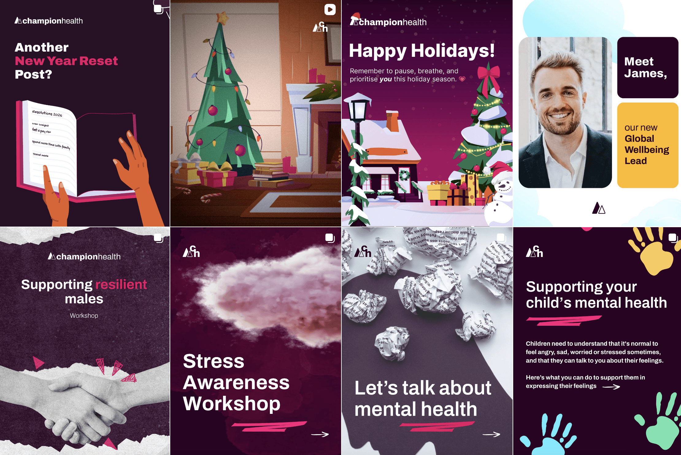

And to animated explainers